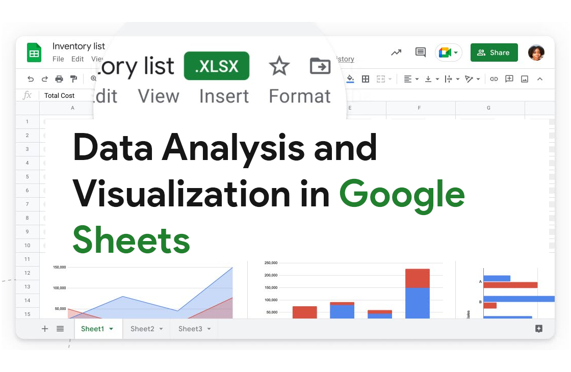
Unlocking the power of data analysis and visualization is a transformative
journey, and Google Sheets emerges as a robust ally in this endeavor.

Specifically, the use of pivot tables and charts within Google Sheets has
proven to be a game-changer, allowing for dynamic and insightful
representation of complex data sets.
1. Pivot Tables: A Dynamic Approach to Data Analysis:
Google Sheets' pivot tables are a dynamic tool that enables users to summarize
and analyze large datasets effortlessly. With just a few clicks, you can
transform raw data into meaningful insights.
The drag-and-drop interface of
pivot tables simplifies the process of arranging and categorizing data,
providing a quick and intuitive way to explore patterns and trends.
2. Streamlined Data Summarization:
Pivot tables excel at summarizing data in a way that is both comprehensive and
easy to comprehend. You can quickly generate summaries, averages, counts, and
more, gaining a bird's eye view of your dataset. This feature is invaluable
when dealing with extensive information, allowing you to distill the essence
of your data for effective decision-making.
3. Flexible Data Reorganization:
One of the standout features of pivot tables is their flexibility in
reorganizing data on-the-fly. Whether you need to pivot rows into columns or
vice versa, Google Sheets provides a seamless experience.
This adaptability
ensures that you can tailor your analysis to suit the specific insights you're
seeking, fostering a customized and efficient data exploration process.
4. Dynamic Chart Creation:
Complementing the power of pivot tables is the ability to create dynamic
charts within Google Sheets. The integration between pivot tables and charts
allows for real-time updates as your data changes.
This dynamic relationship
ensures that your visual representations are always in sync with the latest
insights, providing a visually appealing and accurate portrayal of your data.
5. Diverse Chart Types for Varied Insights:
Google Sheets offers a plethora of chart types, from bar graphs to pie charts
and scatter plots. This diversity allows you to choose the visual
representation that best suits your data.
Whether you're illustrating trends
over time or comparing different categories, the range of available chart
types ensures that your visualizations are both engaging and informative.
6. Real-Time Collaboration and Sharing:
In the collaborative landscape of today's work environment, the real-time
collaboration features of Google Sheets shine.
Multiple team members can work
on pivot tables and charts simultaneously, enhancing the collective analytical
capabilities of the team. The ease of sharing and accessibility ensures that
insights are readily available to all stakeholders.
7. Advanced Filtering and Slicing:
For a more granular analysis, Google Sheets provides advanced filtering and
slicing options within pivot tables. This allows you to drill down into
specific subsets of your data, uncovering hidden patterns and gaining a deeper
understanding of the factors influencing your insights.
8. Data Validation and Accuracy:
Ensuring the accuracy of your analysis is paramount. Google Sheets
incorporates data validation features within pivot tables, alerting you to any
discrepancies or errors in your dataset. This commitment to data accuracy
instills confidence in the insights derived from your analysis.
The integration of pivot tables and charts in Google Sheets
offers a dynamic and comprehensive approach to data analysis and
visualization.
As I continue to explore and leverage these tools in my
analytical pursuits, the efficiency, flexibility, and collaborative features
consistently stand out. Google Sheets has truly elevated the art of
transforming raw data into actionable insights, making it an indispensable
tool for anyone seeking to harness the power of data analysis and
visualization.

Post a Comment